Windows has adopted new Logo for their upcoming Windows 8 Operating System. The Reason Behind this is Unveiled now. Lets have a look on this.
Actually, I’m not a fan but I can understand the idea of the evoking the Metro interface. But is seems, it does'nt represents the Windows 8 Brand but looks like a visual theme. There is huge color difference between old logo and newer one, which would be a noteworthy decision. The four-color panes are a little loud part, actual windows 8 works in an 8-bit graphics mode.

See the Difference of Windows Logos
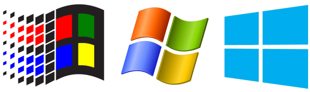
Can you spot the huge difference?
Actually, I’m not a fan but I can understand the idea of the evoking the Metro interface. But is seems, it does'nt represents the Windows 8 Brand but looks like a visual theme. There is huge color difference between old logo and newer one, which would be a noteworthy decision. The four-color panes are a little loud part, actual windows 8 works in an 8-bit graphics mode.
See the Difference of Windows Logos
Can you spot the huge difference?


0 comments
Post a Comment